Three tools, one problem: people couldn't see what mattered
Cigna runs a large network of internal applications built by separate teams. Over time they drifted apart: engineers couldn't find reusable components, claims agents fought a decades-old dental system, and executives had no fast way to see which vendors put member data at risk. I worked across all three, with research, IA, interaction design and handoff for each.
Fragmentation slowed every team down
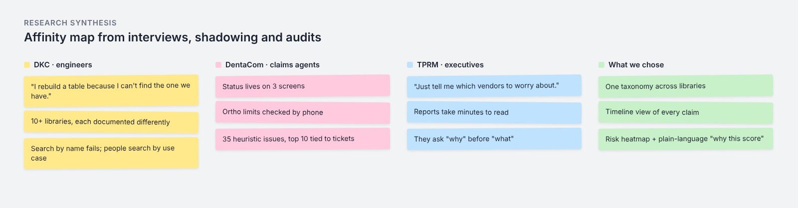
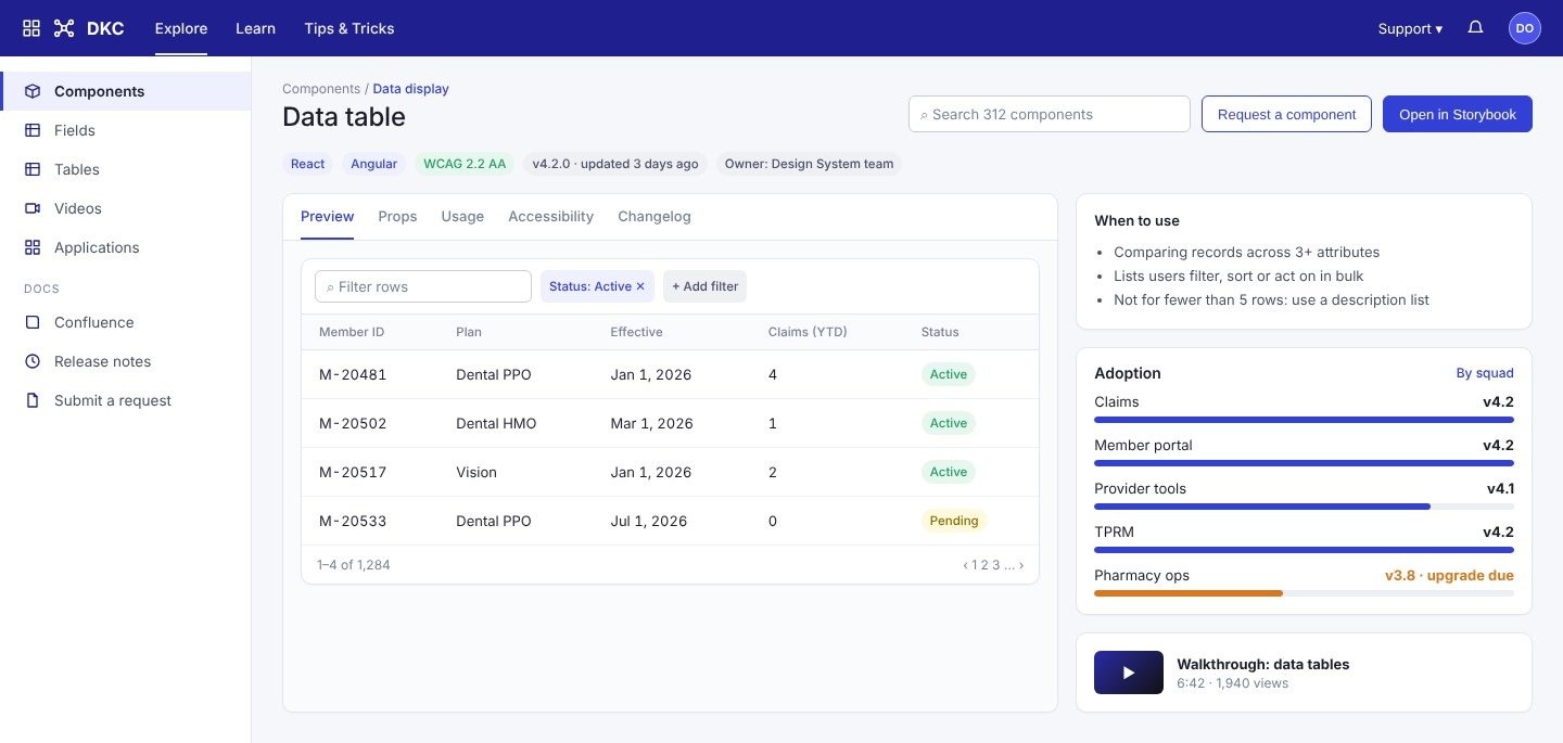
DKC: 10+ internal libraries with inconsistent documentation, so engineers rebuilt components that already existed. DentaCom: an aging claims system with low visibility into claim status and ortho benefits, driving support tickets. TPRM: risk data lived in reports that took minutes to interpret, which is too slow for an executive briefing.
- Duplicate components and slow onboarding
- Claim status and benefits hidden across screens
- Vendor risk buried in dense reports
Watching the work before redesigning it
DKC: interviews and surveys with 15 engineers and content specialists, a usage-log and heuristic audit benchmarked against Confluence and Storybook, two personas (Component Seeker, Library Maintainer) and 3 rounds of moderated testing. DentaCom: 20+ hours shadowing claims processors, interviews with 8 providers, 5 agents and 4 support staff, 35 heuristic issues mapped to jobs-to-be-done and prioritised with MoSCoW, then 2 rounds of prototype testing. TPRM: 3 discovery workshops with executives, risk-metric mapping with the BI team, and 6 senior end-user interviews on visual comprehension.
“Abstracting complex risk models into visuals an executive can read in a glance, without losing the depth an analyst needs.”
Taxonomy, timelines and a risk view built for a glance
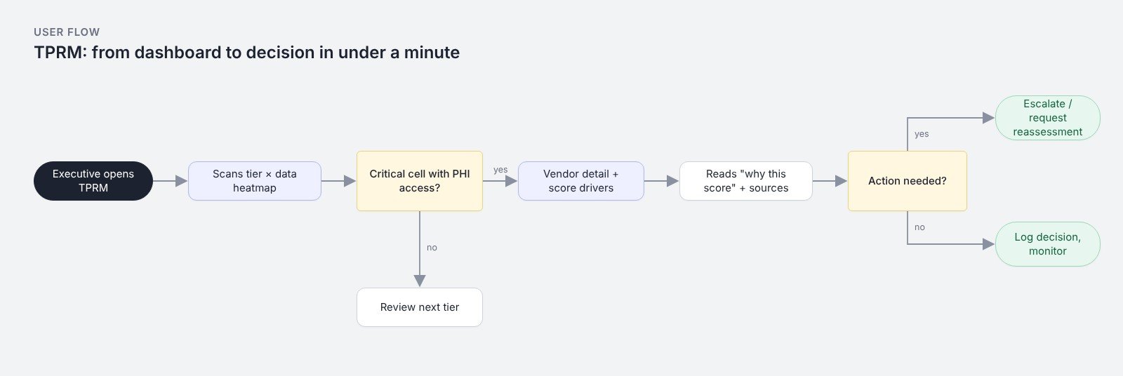
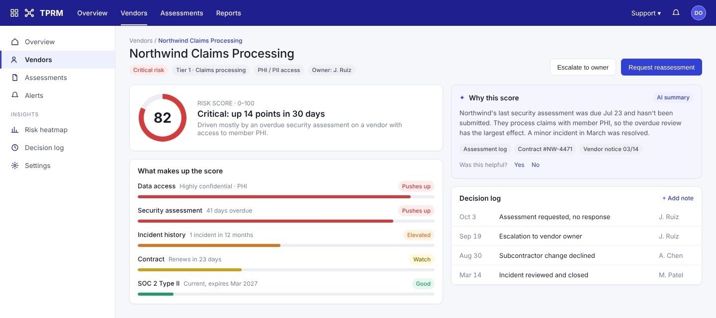
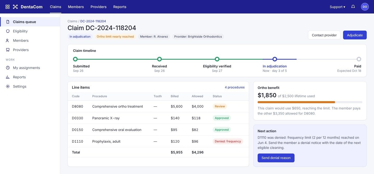
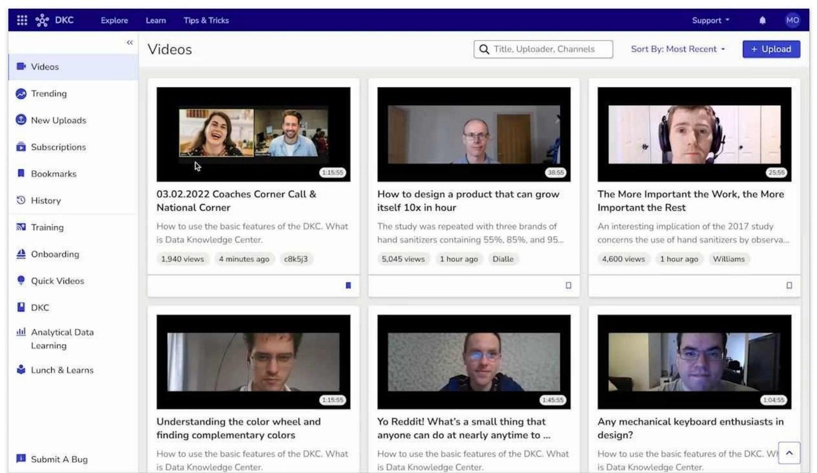
DKC got a unified taxonomy across 10 libraries (Fields, Tables, Video, Applications, Confluence), AG Grid tables with live filters and inline docs. DentaCom got a timeline-based claim history, clear status indicators, a live eligibility check during intake, and role-based dashboards for providers and admins. TPRM got a tier-by-data-sensitivity risk heatmap, urgency filters, drill-down vendor cards with a score breakdown, an AI-written 'why this score' summary with sources, and a decision log.
Measured after launch
TPRM cut the time for executives to spot a high-risk vendor from 3 minutes to 45 seconds and was approved for roll-out after executive validation. DentaCom improved task success on status checks by 60%, reduced ortho-coverage support tickets by 40%, and shipped its MVP 3 weeks early through a prioritised roadmap. DKC made component discovery 30% faster, cut duplicate or outdated components by 50%, and raised developer satisfaction 40% in the post-launch survey.
Adoption beats polish
A design system succeeds on adoption, not quality alone, so governance (versioning, request approvals, naming rules) mattered as much as the components. On TPRM I learned to co-design scoring logic with data science early: the visual is only as trustworthy as the model behind it, and executives asked 'why' before they asked 'what'.